Quantcast
Channel: Blog - amCharts
Viewing all 101 articles
Browse latest View live

JavaScript Charts 3.11 Brings New 3D Features

$
0
0

We have just released a new version of both JavaScript Charts and JavaScript Stock Chart products.

The most notable improvement is the additional of new cylindrical 3D features to most of the chart types. Effective immediately you can create stunning new charts like 3D cylinder columns, Barrel gauges, 3D funnels, and many more.

Cylinder charts

Check out the change log for more updates in this release.

Like always, head over to our Downloads section to download the free version or Support area for commercial one.

The post JavaScript Charts 3.11 Brings New 3D Features appeared first on amCharts.


New advanced JavaScript Stock Chart features

$
0
0

We feel that among the exciting new 3D features introduced in the last version of JavaScript Charts there were lost a few other less stunning visually but equally as important new improvements. Here they are:

Crosshair cursors

Now you can specify the cursor to not only show a vertical line to the category axis, but also horizontal one to value axis of your choice, with (optionally) value balloon shown.

Use valueLineEnabled and valueLineBalloonEnabled properties to turn on this great analytic helper tool.

Professional candlesticks

Now you can enable an alternate behavior for candlesticks (proCandlesticks). If enabled, the candlestick fill logic will be applied based on the previous value. This is how it's done in the professional stock charts.

Here's a fully-featured realistic example showcasing both of the above.

The post New advanced JavaScript Stock Chart features appeared first on amCharts.

Keenthemes Metronic admin theme integration

$
0
0

Finally your theme-seeking comes to an end, the guys from Keenthemes integrated amCharts to their Metronic admin themes.

The most popular admin theme on themeforest comes with tons of features, endless layout options, full SASS support, 200+ template pages, 600+ UI Components and everything you were simply looking for in one package.

Ensure to grab one copy and you will receive a coupon code be able to receive a 15% discount on our products. Click on the image below to get directly to the amCharts sample page.


The post Keenthemes Metronic admin theme integration appeared first on amCharts.

Version 3.12 of JavaScript Charts and Maps brings the power of CSS styling

$
0
0

The release of the milestone 3.12 version of all amCharts products - JavaScript Charts, JavaScript Stock Chart, and JavaScript Maps - brings an important improvement - the power of CSS styling.

If enabled, the chart or map will attach relative class names to virtually any element. (or its sub-elements) This opens up endless capabilities to style, animate and otherwise modify the appearance and behavior of your charts and maps.

Here's an example of the chart, enhanced CSS:

See the Pen CSS Animations by amCharts (@amcharts) on CodePen.

Getting started

Take a look at this tutorial to get you started.

Compatibility note

Styling with CSS is supported on modern browsers that use SVG. Legacy browsers such as IE7 and older that use VML to render graphs are not supported, because VML is not compatible with CSS.

Furthermore, even the latest versions of Internet Explorer do not support CSS animations of SVG elements.

The post Version 3.12 of JavaScript Charts and Maps brings the power of CSS styling appeared first on amCharts.

Introducing responsive charts and maps

$
0
0

The release of version 3.13 marks important milestone - true responsive features. [Download]

These features come in the form of our own in-house developed plugin - first in the series. Available directly in the /plugins/responsive/ subdirectory in the ZIP archive of all amCharts products.

How does it work?

The plugin works by scaling-down and -up chart visual features based on the actual viewport available to the chart or map.

For example, a fully-featured serial chart, complete with legend, guides, axis and chart titles, etc. will scale down to accommodate smaller resolutions by removing certain elements at certain dimensions, like legend, axis titles, guides, chart titles, zoom controls, moving labels inside plot area, all the way down to a sparkline / microchart.

It will do this automatically, no need to redraw the chart or do anything on user's part. It will even work dynamically as you resize window or chart container, or change the orientation of your mobile device.

Here are a few examples:

Responsive serial chart

Responsive serial chart


Responsive pie chart

Responsive pie chart


Responsive map

Responsive map

And here's a live demo for you:

See the Pen Responsive serial chart by amCharts (@amcharts) on CodePen.

What about mobile?

We've got you covered!

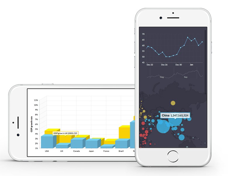
The chart will adapt to mobile resolutions just as well. Even when mobile device orientation changes (i.e. you rotate your iPhone from vertical to horizontal position), depending on how your web page is set up to behave, the responsive features will kick in to accommodate to the new resolution:

Responsive chart on iPhone

Responsive chart on iPhone

I want in! What do I do?

You will need to upgrade your JavaScript Charts, JavaScript Stock Charts or JavaScript Maps to v 3.13.

You will also need to do two steps to enable responsive features:

  1. Include plugin on your pages (/plugins/responsive/responsive.js)
  2. Enable plugin for your chart instances ( responsive: { enabled: true } )

We also suggest this tutorial for further reading: (contains much more information about plugin and how it can be used)

The post Introducing responsive charts and maps appeared first on amCharts.

Non-overlapping bubbles instead of countries + GRAVITY

$
0
0

OK, so you can easily create a bubble map with amCharts, where bubble is placed in the middle of a country area and the size of a bubble depends on some value in your data. That is nice, however what if I want to have those fancy maps which you can find in National Geographic or some other magazine, where the whole map is created of such bubbles and they don't overlap, giving a much more clear and beautiful picture? Can we do that? Yes!

To solve bubble overlapping, we need collision detection. And not only to detect collision, but to move bubbles apart so that they would not overlap. It's not as trivial task as it might seem - if you try it yourself, most likely you will end up with endless loops which will eat all the CPU of your computer. Luckily, we have ready to go solutions - physics libraries. Preventing objects from overlapping is bread and butter for physic engines. Plus, they would allow adding more fancy animations and effects to our maps, not just solve overlapping.

So we picked the first phys engine which came to our mind - box2d, one of the JavaScript ports - box2dweb and started coding. And here is the result.

See the Pen Bubbles instead of countries + Gravity by amCharts (@amcharts) on CodePen.

Without bubble data, it's just 300 lines of JavaScript! What we did is created a box2d world and added the same size bubbles to it. Created static sensors at the middle of each country and attached bubbles to those sensors. The box2d world follos physics rules and we simply observe positions of bubbles and adjust bubbles on map - that's it. When you press "Release bubbles" button, we simply destroy joints and restore them when "Attach bubbles" button is clicked. Imagine endless possibilities of this combination!

The post Non-overlapping bubbles instead of countries + GRAVITY appeared first on amCharts.

Fun with physics in Data Visualization

Version 3.14 Released – Our biggest update ever

$
0
0

We have just released a new version 3.14 (or PI as we called internally). And since π is the coolest number, it had to be the most exciting update to V3 product line ever.

If you're eager to get the complete list of changes and updates, skip to the end of this post.

Otherwise, here are a few highlights we're especially proud to point your attention to:

New export plugin

I mean we had chart export to images before. But now we have super-configurable, powerful and good looking plugin, that will not only export your images to JPG, PNG, SVG image formats, but will also save it as PDF, print it or even let you annotate or even execute your own JavaScript functions and do other cool stuff.

Enabling export on charts or maps is as easy as adding a few lines of code

Enabling export on charts or maps is as easy as adding a few lines of code


Adding annotation to the chart before export to image or PDF

Adding annotation to the chart before export to image or PDF


Find out more tricks on this tutorial page.


GANTT chart type

You can now create those multi-segmented bar charts that span time or value ranges.

GANTT charts usually depict task allocation over time

GANTT charts usually depict task allocation over time


Here's a live demo.


Better touch support

We've revamped all built-in controls for easier handling on touch devices.

Bigger grips are easier to handle on touch devices

Bigger grips are easier to handle on touch devices


The complete list of improvements

  • New chart type: GANTT.
  • Export as image completely rewritten. In addition to image formats it now supports exporting to PDF as well as saving data to JSON, XML or CSV. Annotation mode added, which enables free-draw annotations prior to exporting. Print function added.
  • New icons such as resize grips, zoom-out lens, stock chart’s drawing icons – we made them bigger for better UX for touch screen users. You can find old icons in the amcharts/images/ folder if you prefer using them instead.
  • Date-based value axis is now available. You can use it with both XY and Serial charts. Set "type" property of ValueAxis to "date".
  • minimumDate and maximumDate properties added to ValueAxis. These properties allow you to set min/max of valueAxis when axis type is "date".
  • strictMinMax property added to ValueAxis (default: false). If set to true it will follow minimum and maximum properties strictly.
  • Chart now automatically adjusts it's size when container size changes. You no longer need to call validateSize() method. This applies also if you show/hide div by setting display: none for chart div.
  • dateFormat added to AmGraph. It is used in balloons if value axis is date-based.
  • dateFormats property moved from CategoryAxis to AxisBase (as both axes now support date-based data).

The post Version 3.14 Released – Our biggest update ever appeared first on amCharts.


Export now supports annotating charts with text, icons, arrows

$
0
0

The new 3.15 version of our products brings a significant upgrade to the Export plugin. Among some under-the-hood enhancements it introduces new tools to its annotation mode.

New Export plugin version introduces icons, lines, arrows

New Export plugin version introduces icons, lines, arrows


In addition to adding curves, you can now add icons, lines, arrows and text.

You can now also set opacity for all those objects.

And, if you have a modern browser, you can drag any image directly to the chart.

Annotating the map

Annotating the map


To take advantage of the new features, just grab the latest version of your favorite amCharts library. (If you are loading the libraries directly from amcharts.com, no additional actions are needed)

The default configuration has been updated to include the new tools. However, if you want to get all technical, make sure you check out the Export plugin docs.


The post Export now supports annotating charts with text, icons, arrows appeared first on amCharts.

Version 3.15 Released – Brings massive list of new features and fixes

$
0
0

We're happy to announce that we have just released a new massive update - Version 3.15 across all product lines.

Most of the features and fixes in this release came from direct communications from our users. Thank you!

Among the most notable ones are:

  • Trend lines now support images. You can use them to add any image anywhere on the chart.
  • Export plugin annotation mode now supports adding icons, text, lines, arrows as well as setting opacity of all the objects. [More info]
  • All event listeners can now be added directly via JSON config. No need to add them separately via addListener.
  • Labels are now wrapped and rotated more intelligently all around the chart.
  • Mouse position mechanism was completely revamped for the CSS3 world.


Make sure you download this version and update yours. (if you are loading the libraries directly from amcharts.com, you're all set already)

Here's the whole scoop of what's new:

  • Trend lines now support images. You can have image on both end and start of a trend line. It can be GIF, PNG or SVG (SVG won’t be visible on IE8) images. initialImage andfinalImage properties and Image class were added to support this feature.
  • Annotation capabilities of the Export plugin were dramatically enhanced with the ability to add text, shapes, lines and arrows, as well as changing of opacity of items. More info.
  • You can add event listeners in JSON chart config now, for example:
    “chartCursor”:{
    “listeners”:[{“event”:”changed”, “method”:handleCursorChange},{“event”:”onHideCursor”, “method”:handleCursorHide}]
    }
  • categoryBalloonText property with default value [[category]] added to ChartCursor. You can have [[toCategory]] tag in there and show category ranges this way.
  • autoWrap now works with vertical CategoryAxis. You should set chart.autoMargins = false or categoryAxis.ignoreAxisWidth = true in order this to work. You might also need to adjust margin to give labels some space.
  • labelRotation, autoRotateCount and autoRotateAngle now work with ValueAxis (when chart is rotated).
  • titleRotation property added to AxisBase. Sets rotation angle of the axis title.
  • autoWrap now works with date-based category axes.
  • onePanelOnly property added to ChartCursorSettings. If you set it to true, Stock Chart will display cursor and value balloons on currently hovered panel only.
  • top and bottom options added to showBalloonAt property of AmGraph. Balloon will be glued to the top/bottom of plot area if you set one of these.
  • pointPosition property added to ValueAxis, default value is “axis”. Alternative value is “middle”. Works with radar charts only. If you set it to “middle”, labels and data points will be placed in the middle between axes. (demo coming)
  • showZeroSlices property added to AmSlicedChart. Default value is false. If you set it to true, the chart will display outlines (if visible) and labels for slices even if their value is 0.
  • “AbsHigh” option added for periodValue property of StockGraph. When data is grouped to longer periods, the graph will show highest absolute value (positive or negative).
  • compareGraph property added to StockGraph. This allows you to set any of AmGraph properties on compared graphs instead of using old-style properties like compareGraphBulletBorderThickness. For example:
    stockGraph.compareGraph = {“bulletBorderThickness”:2, “lineAlpha”:0.4}.
  • If you change graph’s line color using lineColorField, balloon now respects this color and adjusts it’s fill or border color.
  • Title of a chart now auto-wraps if container size is smaller than title itself.
  • Mouse position detection mechanism updated. It is now compatible with CSS3 translate transform (rotation is not yet solved).
  • Radar chart supports date-based data now.
  • Compared graphs of Stock charts ids used to be unpredictable, now they are formed like this: “comparedGraph_” + stockGraph.id + “_” + dataSet.id
  • Bug fix: word-wrapping problems fixed.
  • Bug fix: pie chart with non-default startAngle could not solve label overlapping in some cases.
  • Bug fix: 3D pie chart with startAngle = 270 was placing slices at incorrect z-indices.
  • Bug fix: Stock chart’s grouping to periods with alwaysGroup set to true was not working properly in some cases.
  • Bug fix: the chart could be rendered incorrectly if display style of a container div changed from “none” to “block”
  • Bug fix: legend was missing space between entries and right border.
  • Bug fix: stacked graphs of radar chart were filled to the chart center instead of the graph.
  • Bug fix: radar chart’s axis title was not positioned properly.
  • Bug fix: pie chart’s labels could get under slices in some cases.
  • Bug fix: minimumDate and maximumDate properties of ValueAxis did not accepted dates as strings, even if chart.dataDateFormat was set.
  • Bug fix: 3D pie with big depth3D was not rendered correctly.
  • Bug fix: null values were converted to 0 when parsing data.

The post Version 3.15 Released – Brings massive list of new features and fixes appeared first on amCharts.

New V3.16 with revamped touch controls, crisp-clear icons released

$
0
0

We're happy to announce that we just released a new milestone Version 3.16 across all amCharts products.

If you're using amCharts CDN, you're already set. If you're hosting your own libraries, grab the update from Downloads (free version) or Support area (commercial versions).

Revamped touch device support

The most notable change is a completely revamped touch device support. You'll notice the improved handling on mobiles ant tables immediately. Now, the chart will not block you from swipe-scrolling or pinch-zooming the whole page. You will still be able to "tap into" a chart or map to enable internal pan or zoom inside it. "Tap outside" and you regain back your page control.

Regular tap events, like interacting with legend, clicking on chart items, etc. will not require tapping into the chart. They will work on first tap.

Touch devices have better support in V3.16

Touch devices have better support in V3.16

Mouse controls are not affected by this change in any way.

Crisper icons through SVG

We got rid of the PNG images. Now icons - magnifying glass, scrollbar grips, etc. - are pure homegrown SVG, ensuring the crystal clear appearance on all those Retina displays.

Naturally, non-SVG browsers will fall back to PNGs.

Complete change log

  • Charts now use SVG icons for scrollbar, zoom-out and others (IE8 keep using PNG). This makes icons look good on retina displays on all resolutions. New AmChart property svgIconswith default value true was created. If you want PNG icons to be used all the time, set this property to false.
  • Default value of zoomOutButtonImage of AmRectangularChart changed to lens. If svgIcons is set to true (default) .svg will be added to the file name if SVG is supported by the browser, otherwise – .png.
  • Chart behavior on touch events improved.
  • tapToActivate property added to AmChart, with default value true. This is our new approach to solve issues with scrolling of a page on touch devices. Charts which require gestures like swipe (charts with scrollbar/cursor) or pinch (maps) used to prevent regular page scrolling and could result page to stick to the same spot if the chart occupied whole screen. Now, in order these gestures to start working user has to touch the chart/maps once. Regular touch events like touching on the bar/slice/map area do not require the first tap and will show balloons and perform other tasks as usual. If you have a map or chart which occupies full screen and your page does not require scrolling, set tapToActivate to false – this will bring old behavior back.
  • leaveAfterTouch property added to ChartCursor and ChartCursorSettings with default value true. This makes cursor and balloons to remain after user touches the chart.
  • We changed default value of fixedPosition of AmBalloon to true. We think this brings a better usability for touch devices. This results roll-over balloon to point to a fixed position of a slice/column/bullet instead of following the mouse. Note, AmMap overrides fixedPosition to false, as countries are of a irregular shape and it’s quite often that middle point of a country is outside the country itself.
  • showBullet property added to StockEvent, with default value false. If you set it to true, the data point will display both event and regular (if set) bullet.
  • recalculateValue added to StockGraph. Possible values are Open, Close, High, Low, Average and Sum. There is no default value set – graph uses it’s periodValue when calculating changes. For example, the graph’s periodValue is Close. This means that when data is grouped to longer periods (months for example) when recalculating, the graph will use Closevalue of the first period of the selection as base value and will compare each months Close value to it. If you set recalculateValue to Open, the first value of a month will be used as base value.
  • Second attribute, skipEvents added to validateNow method of AmStockChart.
  • autoDisplay property added to AmChart with default value false. If you set it to true the chart will automatically monitor changes of display style of chart’s container (or any of it’s parents) and will render chart correctly if it is changed from none to block. We recommend setting it to true if you change this style at a run time, as it affects performance a bit.
  • Bug fix: roll-over balloon could hide under legend if legend position was right or left.
  • Bug fix: if chart has more graphs than colors in colors array of a chart, graph’s color was chosen automatically. The problem was that this color was chose each time user hid/showed the graph.
  • Bug fix: setting font sizes using CSS not worked properly in some cases.
  • Bug fix: chart’s title ignored bold = false setting and always showed bold title.

The post New V3.16 with revamped touch controls, crisp-clear icons released appeared first on amCharts.

Use case: hanglos.nl

$
0
0
hanglos.nl - a popular kitesurfing community website

hanglos.nl - a popular kitesurfing community website

hanglos.nl - a website dedicated to kitesurfing community in The Netherlands - took it to amCharts to visualize their data on weather conditions. The developers pushed the charts to the limit by applying a number of advanced techniques to make the charts both very useful and attractive.

This post will outline a few of those.

Value-bound Striped Fills

The requirement called for two date/time-based graphs, with fill between them. While it being easy, the requirement was to fill using multiple colored stripes that start and end at certain values.

Using multiple overlaid graphs to generate striped fills

Using multiple overlaid graphs to generate striped fills

The team managed to achieve that by leveraging amChart's ability to alternate the colors and opacity of the fills between below and above “positive”/”negative” threshold. (negativeBase) and by using multiple overlaid graphs with different negative thresholds to create the effect of multiple strip fills.

Trend lines were used to display the wind direction icons. A trend line is an object that can start and end at any point and value of the chart. It can also have SVG icons attached to its either end, which in turn can have color, size and rotation set. This proved to be perfect application for the task.

See this in action.

Lazy-loading of Charts

Another page on the website presented yet another challenge. While the above chart is complex, the charts on the are very basic, but there are a lot of them.

One chart takes fractions of a second to build. Yet, having tens of those can add up to significant load on the browser and bog it down, degrading user experience.

Using lazy-loading technique to load multiple charts

Using lazy-loading technique to load multiple charts

The team overcame it by applying the “lazy-loading” technique. This means that charts initialize only when they are actually scrolled into view. This means that the page has to initialize only a few charts on load, leaving the rest for later.

The approach not only saves the day by reducing overall initial load, but also produce a nice side-effect of animating the charts as they appear on page when scrolling.

To apply lazy-loading for your own charts, check out the basic plugin code on this example.

Here’s a page in question.

More info?

Check out amCharts website for more clever and sometimes crazy demos, tutorials and tips.

Or, should you need assistance with your own charts, drop a line at contact@amcharts.com.

The post Use case: hanglos.nl appeared first on amCharts.

New massive update V3.18 brings a slew of exciting features

$
0
0

After record-breaking nearly two months in the making, version 3.18 is finally out!

The main features of this release are dramatic performance enhancements, zoomable/scrollable value axes, pinch-to-zoom gesture support on serial charts, smoother animations, radial gradients in pie charts, and the whole new drop-shaped balloon option.

Version 3.18 introduces value axis zooming and drop-shaped balloons

Version 3.18 introduces value axis zooming and drop-shaped balloons

Head over to our Download section to grab the latest files.

Here's the full list of changes:

  • valueScrollbar added to SerialChart. Adds ChartScrollbar to ValueAxis. You can set autoGridCount to true to enable axis labels. This trick can also be used by XY chart (albeit by using regular chartScrollbar property, not valueScrollbar). Here is a demo of serial chart with value scrollbar.
  • valueZoomable property added to ChartCursor (default: false). If set to true, makes the cursor zoom value axis(es) as well. Works best if valueScrollbar is added to a chart. Here is a GANTT chart with zoomable value axis.
  • You can now pan XY chart with chart cursor (previously it was only possible to select area for zoom-in). To enable this feature, set pan property of ChartCursor to true. To enable pan of value axis on Serial chart, set valueZoomable of ChartCursor to true. XY Chart with pan enabled demo.
  • maxZoomFactor is now property of AmRectangularChart, with default value 20. Specifies max zoom factor of ValueAxis.
  • drop property (default: false) added to AmBalloon (not supported by IE8). Allows having drop-shaped balloons. Note, these balloons will not check for overlapping with other balloons, or if they go outside plot area. It also does not change pointer orientation automatically based on its vertical position like regular balloons do. You can use pointerOrientation property if you want it to point to different direction. Demo of a chart using this kind of balloon.
  • pointerOrientation property added to AmBalloon, with default value down and other possible values left, top, right, bottom. Works only if balloon.drop set to true.
  • zoomOutValueAxes() method added To AmRectangularChart. When invoked, it zooms-out value axes.
  • gradientType added to AmPieChart. The default is now at "radial". (previously chart supported only linear gradients) It makes a lot more sense to have radial gradients on pie chart. Note, IE8 does not support this. Here is pie chart with gradient fill example.
  • minValue and maxValue properties added to AmXYChart. These can be used to adjust size/scale of bubbles. If these properties are not set, the bubble with smallest value will be of minBulletSize and bubble with biggest value will be of maxBulletSize. However, you might want bubble size to change relative to 0 or some other value. In this case you can use minValue and maxValue properties. Note, if you use these two settings, you might also want to set minBulletSize to 0.
  • balloonText property added to TrendLine. When set, enables displaying a roll-over balloon.
  • onShowCursorzoomStarted, panning events added to ChartCursor.
  • limitToGraph property added to ChartCursor. If set to an id or a reference to AmGraph object, CategoryAxis cursor line will be limited to this graph instead of being drawn through full height of plot area. Note, this works with serial chart only. Also, cursorPosition of ChartCursor must be set to middle.
  • syncWithCursor(cursor) method added to ChartCursor. Allows to sync one serial chart's cursor with another chart's cursor.
  • balloon property added to AmGraph and AxisBase. Allows customizing axes and graphs balloons individually (only when ChartCursoris used). Note: the balloon object is not created automatically, you should create it before setting properties, for example: graph.balloon = {drop:true} and not graph.balloon.drop = true.
  • valueLineBalloonEnabled now adds value balloons to all available value axes (both Serial and XY chart).
  • animationFinished event added to AmChart. It is dispatched when graphs or slices finish animating.
  • zoomOutAxes property added to PanelsSettings (default: true. Specifies if zoomed-in value axes should be zoomed-out when user changes selected period with PeriodSelector.
  • processTimeout property added to AmChart and AmStockChart (default: 0). If you set it to 1 or some bigger value, chart will be built in chunks instead of all at once. This is useful if you work with a lot of data and the initial build of the chart takes a lot of time, which freezes the whole web application by not allowing other processes to do their job while the chart is busy.
  • Serial chart now has property processCount (default 1000). If processTimeout is > 0, 1000 data items will be parsed at a time, then the chart will make pause and continue parsing data until it finishes.
  • buildStarted event added to AmChartand AmStockChart. Fired just before the chart starts to build itself for the first time. Note: you might need to set processTimeout to > 0 value in order to register this event properly.
  • You can set categoryAxisDateFormat of ChartCursor to undefined now. If set cursor's category axis balloon will use current date format of category axis.
  • Bug fix: chart cursor was not working properly on mekko chart (variable column width chart).
  • Bug fix: addressed pan freezing issues introduced in Chrome v47.
  • Bug fix: Microsoft Edge was ignoring touch-move events.
  • Bug fix: stacked areas on date-based chart could start on wrong place after graph was hidden.
  • Bug fix: AmAngularGauge was broken if legend was added.
  • Bug fix: showNextAvailable property of ChartCursor was ignored by legend.
  • Bug fix: Pyramid chart did not display the tip of the pyramid in some cases.
  • Bug fix: init event was not fired by AmAngularGauge.
  • Bug fix: sometimes init, rendered and draw events were fired too early, before the chart was actually drawn.
  • Bug fix: mouse wheel zoom was not working on IE8.
  • Bug fix: if autoSize of AmChart was set to false, mouse position was not properly detected after page was scrolled.
  • Bug fix: selectFromStart property of PeriodSelector was not working properly with period button which used YYYY period.
  • Bug fix: it was impossible to delete guides which were added via chart config (using eraser tool of Stock chart).
  • Bug fix: string-based dates in guides were not being parsed properly if they contained only numbers.

The post New massive update V3.18 brings a slew of exciting features appeared first on amCharts.

Version 3.20.0 introduces accessibility support

$
0
0

We have just released a new version - 3.20.0 of our charts and maps products. Probably the most notable change is the addition of accessibility features.

The descriptive WAI-ARIA labels are now automatically added to key elements like chart columns or map areas. This allows vision-impaired users using screen readers get a feel of the chart or map contents.

For example, hovering on a column in a chart will read out the graph's title and a value. Hovering over a country in a heat map, will read out country name and it's value.

The screen reader content is also fully customizable. See full list of changes below for details.

  • Property accessible added to AmChart class, with default value true. When enabled, chart adds aria-label attributes to columns, bullets or map objects. You can control values of these labels using properties listed below. Note, not all screen readers support these tags. We tested this mostly with NVDA Screen reader. WAI-ARIA is now official W3 standard, so in future more readers will handle this well. We will be improving accessibility on our charts, so we would be glad to hear your feedback.
  • Property, accessibleTitle added to AmChart class. This title will be read by screen reader.
  • Property accessibleLabel added to AmGraph class, with default value [[title]] [[value]].
  • Property accessibleLabel added to AmSlicedChart class, with default value [[title]]: [[percents]]% [[value]] [[description]]
  • Bug fix: in some particular cases angular gauge was changing it’s position incorrectly while changing size of chart container.
  • Bug fix: YTD button of PeriodSelector was not hidden even if no this year’s dates were available in the data.
  • Bug fix: touchDuration property was affecting also clicks, not only touch events.

To download this latest and greatest, head over to our free Downloads section or Support area for commercial downloads.

The post Version 3.20.0 introduces accessibility support appeared first on amCharts.

New version 3.20.4 features accessibility enhancements and automatic grid syncing

$
0
0
A lot of improvements related with accessibility of charts and maps:
  • tabIndex property added to: AmLegend, AmGraph, Title, Label, AmSlicedChart, ChartScrollbar and ChartCursor. In case you set it to some number, the chart will set focus on this element when user hits tab key (after setting focus on all elements with lower tabIndex). When a focus is set, screen readers like NVDA will read label which is set using accessibleLabel property on those same elements. In case it’s ChartScrollbar or ChartCursor, you will be able to move Scrollbar or Cursor with cursor keys of your keyboard. Note, at the moment not all browsers support tabIndex on SVG elements. For now, full support is limited to just Chrome and Opera. Here is full compatibility table.
  • zoomOutButtonTabIndex added to AmRectangularChart. If this property is set to some number, and user presses tab, the page will set focus on the zoom-out button once the browser will reach its tabIndex. When focused, pressing enter will result in full zoom-out of the chart.
  • accessibleLabel property added to AmLegend, with default value "[[title]]". This label will be read by screen reader if chart.accessible is set to true (default) and user rolls-over the legend marker or focuses on it using tab key (in case tabIndex is set on AmLegend).
  • accessibleLabel property added to ChartScrollbar with default value. You can now "zoom" chart using cursor arrows.
  • accessibleLabel of AmGraph default changed to "[[title]] [[category]] [[value]]".
Other changes:
  • autoTransform property added to AmChart with default value false. If you set it to true and your chart div (or any of the parent div) has CSS scale applied, the chart will position mouse at a correct position. Default value is false because this operation consumes some CPU and only few people are using CSS transfroms.
  • synchronizeGrid property with default value false added to AmSerialChart. If your chart has more than one value axes and you set this property to true, the chart will show grid at equal intervals. Note, this is experimental property in beta stage yet.
  • Bug fix: if pie chart had depth3D set and marginBottom was set to 0, 3D part of a pie was hidden below the div area.
  • Bug fix: if a slice of a pie was pulled-out initially, hovering over this slice showed moving balloon even if balloon.fixedPosition was set to true.
  • Bug fix: panning of a AmRectangularChart (if enabled) was broken since last version.
New "synchronizeGrid" setting will automatically sync grids between all value axes.

New "synchronizeGrid" setting will automatically sync grids between all value axes.

The post New version 3.20.4 features accessibility enhancements and automatic grid syncing appeared first on amCharts.


amCharts React component is now available

amCharts WordPress plugin is now WPML-certified

$
0
0

amCharts and WPML

WPML is a de facto standard when it comes to multi-lingual WordPress websites.

For the past weeks amCharts and WPML teams worked together to making our own WordPress plugin and WPML compatible.

We’re extremely happy that amCharts WP plugin is now fully certified as WPML Compatible.

amCharts for WP will now automatically detect WPML and show version of the chart in the current language.

It will also modify TinyMCE modal for charts insertion to list localized versions of the charts.

The post amCharts WordPress plugin is now WPML-certified appeared first on amCharts.

amCharts introduces an open-source Weather Map tool

$
0
0

Here at amCharts we do love all kinds of crazy solutions that people do with our products. Sometimes, we go ahead and do our own in-hours projects as well.

Today we’re announcing one of such tools – Weather Map.

Weather Map

It’s an open-source tool, build on top of our JavaScript Maps and JavaScript Charts products as well as OpenWeatherMap API service.

Links:


The post amCharts introduces an open-source Weather Map tool appeared first on amCharts.

Introducing clearer licensing terms for all purchases after 2017 January 1st

$
0
0

Based on feedback from our commercial users, we have incorporated some minor changes to our commercial licensing terms. The changes take effect immediately and will be applicable to all purchases made on or after January 1st, 2017.

The changes have been designed to both make licenses more transparent and clear, as well as loosen some of the restrictions that did not make a lot of sense.

Here’s a scoop of what’s changed:

  • Single website license is no longer restricted to a single physical server. In a cloud hosting era, there’s no fine line between physical and virtual servers.
  • Single website license now CAN be used in a websites that require log in or are not publicly accessible, i.e. intranet websites. If your website displays the same charts/maps for all users, you can use Single website license regardless of how this website is accessed.
  • We have reworded SaaS/App and OEM licenses so that there’s no longer doubt if the application you produce can be resold by 3rd party resellers.
  • Extended OEM license now explicitly allows use of the license for both the purchaser company AND its wholly owned or controlled subsidiaries. This basically means that a parent company can purchase one Extended OEM license and allow all of its subsidiaries across the world to make full use of it for their own purposes. Contact amCharts for further details about Extended OEM license.
  • All licenses now explicitly allow licenses transfers to other business entities in events of acquisitions or mergers.

To view the fine print of each license, go to our Online Store and click “Read license” link next to the product/license price.

Should you have any questions regarding the above changes, or any other license-related inquiry, feel free to contact us.

The post Introducing clearer licensing terms for all purchases after 2017 January 1st appeared first on amCharts.

DataViz Tip #1: Sort your bar charts by value

$
0
0

Every week we will post a data visualization tip to help you create better visualizations and provide a way to take advantage of the concept using amCharts (where applicable). Subscribe to our newsletter to get notified about new tips and more.

Your data may come in some order or no particular order at all. Whenever the data is not date-based, you want to display it in your bar/column chart sorted by value. This makes it much easier for the person analyzing the visual to perceive the data in comparison and helps you convey your message.

Should you order your chart in ascending or descending order? The answer, as always, is “it depends.” When you want to, say, compare your numbers to your competitors, you should probably go highest to lowest. On the other hand, if you wish to lead the viewers focus to demonstrate some growth – lowest to highest is your choice.

Consider this example:

From this chart, we can clearly see that Amazon is at the top. And if, say, what we care about the most is Apple, we can clearly see where it stands compared to others. Consider what would this chart look like if it was ordered by company name. Comparing Apple to Target or Uber would require way more work and concentration from the viewer.

But my data comes from an API that I don’t control. Is there a way to reorder the data with amCharts?

Glad you asked! There’s definitely a way to do that, and we have a knowledge base article demonstrating just that. Check out “Automatically order columns by their value.”

See the Pen Automatically order columns by their value by amCharts (@amcharts) on CodePen.24419


Subscribe to our monthly newsletter and get more data visualization tips.

The post DataViz Tip #1: Sort your bar charts by value appeared first on amCharts.

Viewing all 101 articles
Browse latest View live