Quantcast
Channel: Blog - amCharts
Viewing all 101 articles
Browse latest View live

DataViz Tip #2: Remember the Color-Blind

$
0
0

Unfortunately, accessibility is often an afterthought in many projects. It shouldn’t be this way, and we can all contribute. Today we will talk about one aspect of it – color blindness.

While ignoring color blind audiences could be just an annoyance for them when talking about general graphic elements, it presents a much deeper issue with data visualizations. The goal of data visualization is to show and communicate information in a clear and efficient way, and it all breaks down when a notable chunk of your audience can’t see it clearly.

According to Wikipedia:

Red–green color blindness affects up to 8% of males and 0.5% of females of Northern European descent.

protanopia - red-blind

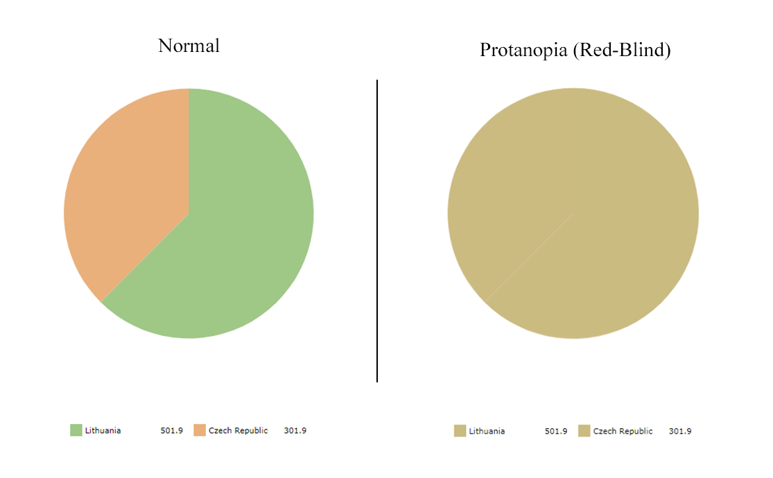
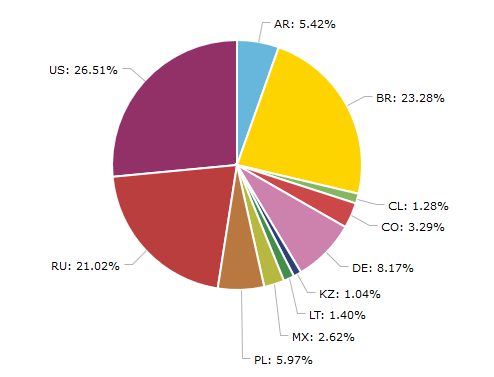
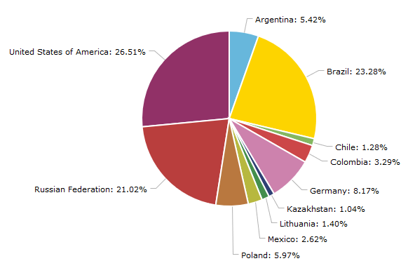
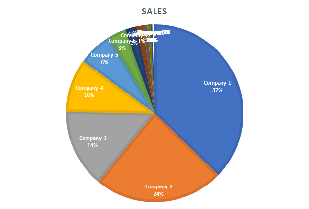
In the above image on the left, you can see a simple and perfectly legible pie chart as seen by someone with normal vision. On the right is what someone with red-blindness (protanopia) sees. As you realize, this chart is utterly worthless and confusing for such a person.

Luckily, we have tools at our disposal to test legibility of our data visualizations as seen by various color-blind people and correct the issues.

  • Coblis helps people with normal vision see their creations through the simulated eyes of color-blind people. You should use it to test color palettes of your current and future visualizations.
  • ColorBrewer offers color advice for best legibility and has an option to show color-blind safe palettes only.

Here are some additional tips to improve your results:

  • Outline chart elements (bars, slices, etc.) to help everyone see the boundaries of these parts even if they are hardly distinguishable by color;
  • Use data labels whenever possible to convey the data in textual form in addition to color and shape;
  • Use interactivity (tooltips, contrasting outlines, distinct colors) to increase understanding of the data while exploring the chart.

Colors in amCharts

At amCharts we take accessibility very seriously. Our bundled themes, while not explicitly designed for color-blind, provide very legible results in most circumstances. Additionally, we offer a “patterns” theme that uses patterns instead of colors. To maximize clarity for every person, we recommend implementing a “theme switcher” in a similar fashion as we do on our demo page. Refer to this knowledge base article on working with themes.

Having said that, we pride ourselves on being the most customizable charting library out there, and you can express your vision by changing every color of every chart element (check out our class reference for available options). Just remember to follow the tips above and check your final product with color-blindness simulator before publishing.


Subscribe to our monthly newsletter and get more data visualization tips.

The post DataViz Tip #2: Remember the Color-Blind appeared first on amCharts.


DataViz Tip #3: Start Your Column/Bar Charts at Zero

$
0
0

Consider the following chart which represents monthly visits to a fictional website.

Based on your first quick impression, how many more visits did the site get in April compared to February? I’d say about 50 times more. Now, look at the values on the axis. As you can see the correct answer is less than 2x. So, the person looking at this chart is tricked by the factor of about 25x. Unless your goal was to mislead the viewers, this is not a good thing.

We use bar/column charts to visualize discrete quantities. Setting the baseline at zero gives us the most truthful representation of the data and helps viewers see the picture as is.

In amCharts you create a column chart with a “serial” chart type. It supports other serial charts such as line, area, stacked columns, etc. And it calculates the values on the value axis automatically and doesn’t default to zero baseline because of the variety of supported chart types.

To set the baseline to 0, you need to set a minimum property on the value axis like this:

"valueAxes": [{
    "minimum": 0
}]

This way you get a zero-based column chart, as it should be:

See the Pen Zero Baseline in Column chart by amCharts (@amcharts) on CodePen.24419

But what if I want to emphasize the difference? Absolute values just look too close.

Consider using a different chart type – a line chart would be a good candidate. It is probably still better to retain zero baseline in the line chart, but it is less jarring if you don’t, and the nature of connected lines gives a better sense of the direction.

To change chart type from column to line, just change the “type” property to “line” in the graph’s settings:

"graphs": [{
  "type": "line",
  …
}]

Better yet, instead of absolute values use relative growth compared to some base value, say, average monthly visits last year.

Suppose the monthly average last year was 1,200 visits. By recalculating the values to growth percentages, we will get a chart like this.

See the Pen Zero Baseline alternative by amCharts (@amcharts) on CodePen.24419


Subscribe to our monthly newsletter and get more data visualization tips.

The post DataViz Tip #3: Start Your Column/Bar Charts at Zero appeared first on amCharts.

We Are Giving Away Data Visualization Books!

$
0
0

We are starting a new monthly newsletter with data visualization tips, tricks, and other useful information. Subscribe here to get on the list for a no-nonsense high-value content delivered to your inbox monthly.

In addition to sending data visualization content to your email inbox, we will be sending a physical data visualization book to one lucky subscriber’s mailbox each month. The winner will be selected at random from ALL the subscribers, so subscribe early to increase your chances.

The Wall Street Journal Guide to Information Graphics: The Dos and Don'ts of Presenting Data, Facts, and Figures
The Wall Street Journal Guide to Information Graphics: The Dos and Don’ts of Presenting Data, Facts, and Figures

For the first installment of the newsletter (due later in November) we’ve selected a short and to-the-point read: The Wall Street Journal Guide to Information Graphics: The Dos and Don’ts of Presenting Data, Facts, and Figures by Dona M. Wong. Just subscribe to our newsletter using the form below and this book can be yours.

Subscribe to amCharts Newsletter


The post We Are Giving Away Data Visualization Books! appeared first on amCharts.

DataViz Tip #4: What Would Viewers Tweet About Your Chart?

$
0
0

An excellent way to start thinking about your visualization is to ask yourself “what would I want my viewers to tweet about this chart?”

Consider this chart of visits to a fictional website:

Visits to a fictional website

What would someone tweet after looking at this chart? Maybe something like “Most visits to the website come from the USA, followed by China and Japan.”

Now consider this visualization of the same data with one minor change:

See the Pen Viewers focus by amCharts (@amcharts) on CodePen.24419

First of all viewers would be interested in exploring why the bar for Japan is red. After hovering over it they’ll see the message that Japan has jumped 2 places since last year. What would they tweet now? Something like “Japan moves from 5th to 3rd place in most active countries on our website.”

But what if you included more details in that balloon? Like a growth percentage. Or a second graph showing previous year’s numbers? The tweet may look something like “The website got 2x more visitors from Japan this year compared to the previous one.”

As you can see, very minor changes in data representation can affect the narrative in viewers head quite dramatically. Thinking about your charts from this perspective is a powerful way to inform your data visualization design choices.


We are giving away a great data visualization book each month! Subscribe to our newsletter to get monthly tips like the one above and you’ll be automatically entered in the sweepstakes to win an awesome book.

Subscribe to amCharts Newsletter


The post DataViz Tip #4: What Would Viewers Tweet About Your Chart? appeared first on amCharts.

DataViz Tip #5: Sketch and Prototype Your Charts Before Coding

$
0
0

After seeing beautiful amCharts demos, you may have an urge to drop straight into your code editor and start coding. While sometimes you know precisely what chart represents your data best, other times it may not be as obvious. While developing a visualization with amCharts is easy, it is still more work than doing a quick sketch on paper, whiteboard, or your Surface, iPad Pro or Galaxy Note.

When you are done with sketching, or if your dataset is too big or too complex to visualize with pen and paper, you can prototype your charts with good old Excel. It will not produce the most beautiful or interactive results, but it will let you switch chart types quickly and help you spot insights or irregularities in your data.

Finally, use amCharts Live Editor to jumpstart your final visualization.

The post DataViz Tip #5: Sketch and Prototype Your Charts Before Coding appeared first on amCharts.

DataViz Tip #6: Transform and “Massage” Your Data

$
0
0

The data you store and get back is often the most granular – that’s always great to have but not necessarily the best data to expose to users and comprehend.

Suppose you have data for daily site visitors, page views and sales. You can expose all of this data as is in 3 line graphs and let the viewers wrap their heads around it.

See the Pen DataVizTip6-sample1 by amCharts (@amcharts) on CodePen.24419

By looking at the chart above you can only tell that everything is going “up and to the right”, which is probably good, and not much more.

But what if you transform and aggregate the data to a form that makes the most sense to the consumers of your visualization?

For example, your content team is hard at work producing quality content, and they need to know if it clicks with the visitors to the site. They may look at the growing page views chart above and decide they are doing a great job, when in fact it’s just marketing/user acquisition team stepped on the accelerator and is attracting way more users who bounce off as much (or even more) than before. Unless you are monetizing with ads, the absolute number of page views is not a meaningful metric. The more meaningful one for your content team is page views per visit ratio.

The same applies to sales as well – growing sales numbers are always good but are they growing just because you get more visitors to the site or thanks to your improvements in the purchase flow? Absolute numbers can’t answer this question; ratios can.

See the Pen DataVizTip6-sample2-ratios by amCharts (@amcharts) on CodePen.24419

If your primary viewer is someone overviewing both the team tasked with increasing page views per visitor and one working on sales per visitor, it may be difficult for that person to compare both ratios as they are on a slightly or majorly different scales. One solution could be to use multiple value axes (one for each graph) in amCharts which should place the numbers on roughly the same scale.

Alternatively, you can convert your ratios into indices (value divided by the maximum value of the series) and analyze all of the values on the same 0-to-1 scale.

See the Pen DataVizTip6-sample3-indices by amCharts (@amcharts) on CodePen.24419

Additionally, plotting daily numbers may give you a general understanding of the overall trends, but often daily fluctuations could be confusing, especially in low volume businesses. So, you are better off aggregating the numbers over longer periods. Also your sales team may have some sales targets – something like 10% month-over-month sales growth. A chart showing absolute sales numbers growing is nice, but doesn’t inform the team if they are on target. Recalculating values into growth percentages may answer this question easily.

See the Pen DataVizTip6-sample4-salesgrowth by amCharts (@amcharts) on CodePen.24419

As you can see, the visualization is dramatically different from what we had in the beggining and may provide totally different insights and, in turn, value to the user. And the beauty of interactive charts like amCharts is that you still can place the base data on the chart (you can see the total sales for the month by hovering over the columns).


We are giving away a great data visualization book each month! Subscribe to our newsletter to get monthly tips like the one above and you’ll be automatically entered in the sweepstakes to win an awesome book.

Subscribe to amCharts Newsletter


The post DataViz Tip #6: Transform and “Massage” Your Data appeared first on amCharts.

DataViz Tip #7: Tools to Transform Data

$
0
0

Last week we have shown that transforming our data can help us create different and, likely, better visualizations. Let’s cover some tools that can help us in the process…

Pivot Tables

Pivot Tables is a great feature that lets you slice and dice the data you have in your spreadsheet. In Microsoft’s own words:

PivotTables are a great way to summarize, analyze, explore, and present your data, and you can create them with just a few clicks.

Microsoft has a great tutorial on how to create Pivot Tables in Excel (including a video) and a walkthrough tutorial is included in Excel itself. Google Sheets support pivot tables as well.

You may also want to take it one notch up and use Power Pivot add-on for Excel to do more powerful data analysis and create more elaborate data models.

SQL

If you have direct access to your data in a relational database you can use SQL (Structured Query Language) to retrieve the data already transformed for the needs of your data visualization. Learning the basics of SQL is relatively easy, but doing complex and efficient queries is not. There are lots of courses on SQL at places like LinkedIn Learning or Pluralsight (this one is actually free). There are also a lot of tutorials on the web and YouTube. This one seems to have good ratings and reviews:

In case you are more familiar with SQL than with spreadsheets, Google Sheets lets you use SQL to query the data in your spreasheet – something you can’t do with Excel out of the box (there are add-ins, though).

Changing Data Formats

Spreadsheet software can transform your data, but it’s not always that you can feed XSLX files to your data visualization library. The most common format that web tools use these days, and the one we use in amCharts, is JSON. Luckily, there are tools that let you convert your spreadsheet or CSV data to JSON with ease. The one I like is called Mr. Data Converter and it lets you simply copy&paste the cells from Excel and get JSON right away.


We are giving away a great data visualization book each month! Subscribe to our newsletter to get monthly tips like the one above and you’ll be automatically entered in the sweepstakes to win an awesome book.

Subscribe to amCharts Newsletter


The post DataViz Tip #7: Tools to Transform Data appeared first on amCharts.

DataViz Tip #8: Do Not Expose Your Private Data

$
0
0

If you are used to creating charts in Excel, server-side libraries or other desktop software that produces static images, you may be comfortable with taking your private (often confidential) data and creating visualizations straight from it. After all, you control that end-users only see percentages or other aggregate values.

On the other hand, when your render charts on the client via libraries like amCharts, your private data travels over the network to the client browser as is. Even when you display the final visualization without exposing absolute values, the data is there for any curious mind to poke around.

But there’s nothing exactly confidential in my data, you may say. Sometimes even non-confidential data may lead to people making wrong assumptions when they can easily access it. For example, when I exposed absolute numbers used for calculating phone market shares in one of the AdDuplex reports it led to some journalists and enthusiasts misinterpreting these numbers as absolute total numbers of phones in use. Which obviously wasn’t true and led to unnecessary confusion.

That’s why it’s in your best interest to transform the data into the form close to what you will be displaying before sending it over the wire. You may find the tools to help you with that in our previous tip.

The post DataViz Tip #8: Do Not Expose Your Private Data appeared first on amCharts.


DataViz Tip #9: Learn the Basics of Statistics

$
0
0

In the previous tips, we’ve discussed that transforming your data can often expose the information in a new light and provide new insights to the person analyzing your visualization. Aggregating atomic data points into aggregates for periods is a powerful tool in helping users make more sense of the data. But the way you aggregate the data can result in very different outcomes.

As the famous example goes, if you take net worth of 9 regular people and add Bill Gates to the mix the mean net worth of the group would be dramatically skewed by Gates’ number. However, a median would be quite representative.

The bottom line is that you have to be mindful of the way you calculate aggregate numbers and to do that you should be familiar with tools at your disposal.

A good way to start is watching educational videos on YouTube or other platforms. Here are a few from the great Khan Academy:


We are giving away a great data visualization book each month! Subscribe to our newsletter to get monthly tips like the one above and you’ll be automatically entered in the sweepstakes to win an awesome book.

Subscribe to amCharts Newsletter


The post DataViz Tip #9: Learn the Basics of Statistics appeared first on amCharts.

“Information is Beautiful” is our data visualization book of the month and it can be yours!

$
0
0

Last month we gave away “The Wall Street Journal to Information Graphics,” and it’s on the way to Australia to Terry Fitzgerald from Shop A Docket. Congratulations!

Information is Beautiful

In December our data visualization book of the month is “Information is Beautiful” by David McCandless. Contrary to our previous pick, this book doesn’t contain any prescriptive techniques or tips. Instead, it serves as a constant source of inspiration for your data visualization efforts. You can keep it on your desk or coffee table and spend countless hours exploring its fascinating pages.

“Information is Beautiful” can be yours. Just subscribe to our newly minted data visualization newsletter (check out the first installment here), get monthly DataViz tips to your inbox, and you are automatically eligible to win each month for as long as you stay subscribed.

Subscribe to amCharts Newsletter


The post “Information is Beautiful” is our data visualization book of the month and it can be yours! appeared first on amCharts.

DataViz Tip #10: Verify Your Data

$
0
0

“Unlike a misspelled word in a story, one wrong number discredits the whole chart.”
~ Dona M. Wong “The WSJ Guide to Information Graphics”

Sometimes you discover a wild outlier in your data when you visualize it. In some cases, this may be a valuable insight, but more often than not it’s just a side-effect of a faulty data-point. You should always double-check your data and visualizations based on it, but you should be especially suspicious when you see something out of the ordinary before exposing it to your end-users.

Here are a few common issues to look out for:

  • Insufficient data to make generalizations and aggregations. For example, say you are displaying pageviews-per-visitor to your website grouped by country. In some smaller countries, you may have only one visitor, and that person may have browsed through an extraordinarily high number of pages.  Whenever you do such visualizations, consider filtering out data that doesn’t cross a meaningful threshold.
  • Incorrect date anchoring. Suppose you are visualizing a change in some value since yesterday or last month. A common mistake is to calculate “yesterday” based on your web server’s current data or even a date on client’s machine. You should always base such visualization on the dates in your dataset and not an outside world.
  • Percentages vs. fractions. Changes in data over time or shares of a whole are often expressed either in percentages or fractions/indices. Make sure that you are displaying the right format. There’s a big difference between 0.2% and 20% growth.
  • Parts not adding up to a whole. Make sure that no parts are missing when you calculate percentages of a whole. A common mistake is to aggregate data by some field not every record has and then calculate the total including all of the records.

These are only a few examples of how faulty data can sneak in and spoil your charts. The important thing to remember is to always double and triple-check the accuracy of your visualizations before publishing.

The post DataViz Tip #10: Verify Your Data appeared first on amCharts.

DataViz Tip #11: Augment Your Data for Better Visualizations

$
0
0

The data you have is straight to the point most of the times. When you have revenue numbers it’s usually just that. If you want to present the data as revenue-per-employee you have to transform your data to serve your vision. It’s all good while you have all the data that you need. But what if you don’t?

Don’t limit yourself with the data from a single data source. The web is full of data. Starting from the obvious sources like Wikipedia, to data exposed by various government and other organizations, and ending with commercial data marketplaces. Use these sources to improve the quality and impact of your charts.

Using Excel to Augment Your Data

Suppose you have a data table with sales numbers by country like this:

You can take this data and create a chart based on it right away. This is what you will get:

While the chart is factually correct, it is not very user-friendly. How can we improve it? Obviously, with this amount of data you can just replace country codes with names manually and be done with it. But what if you had data for every country and territory in the world with multiple rows for each country? External data to the rescue!

Wikipedia has a page for ISO 3166-1 standard and that page has a table titled “Officially assigned code elements.” We will use this table to augment our data with the help of Microsoft Excel.

Open Excel, navigate to Data tab and click on New Query -> From Other Sources -> From Web

Paste the URL to the Wikipedia’s ISO 3166-1 page https://en.wikipedia.org/wiki/ISO_3166-1 and click OK. Excel will parse all the data tables it finds on the page and present you with this dialog:

Select “Officially assigned code elements” table and press Load. The data from the page will be loaded into Excel:

Now format your source as table by selecting it and clicking the “Format as Table” button:

Name the table for clarity (I will use CountrySales name) and click the “Summarize with Pivot Table” button:

Create the Pivot Table by accepting the defaults in the following dialog. Then you will be offered to create a Pivot Table based on your source data, but that’s not what we want. What we want is to combine our source data with country data from Wikipedia. So we’ll click on the “More tables”:

Click “Yes” when offered to create a new Pivot Table. Now we need to define relationships between our tables. Click on the “Relationships” button:

Then define a new relationship between our tables like this:

And finally we can select “English short name” field from the Wikipedia data as our rows field and “Sales” from our source data as values field to get the dataset we need:

This lets us create a chart that is informative to our end-users and provides data in a form they can easily consume and internalize:


We are giving away a great data visualization book each month! Subscribe to our newsletter to get monthly tips like the one above and you’ll be automatically entered in the sweepstakes to win an awesome book.

Subscribe to amCharts Newsletter


The post DataViz Tip #11: Augment Your Data for Better Visualizations appeared first on amCharts.

DataViz Tip #12: Show Up to Four Lines in a Line Chart

$
0
0

A good rule of thumb is to limit the number of lines shown in a line chart to 3 or 4. Above that the picture gets messy quite fast:

When you need to show more than 3-4 lines consider using a different chart type or a panel of “micro charts” instead.

Having said that, when using an interactive charting library like amCharts, you can have more series in the same chart while showing just the 3-4 most important ones initially and letting the viewer decide if they want to switch other lines on or off.

Just set "hidden": true on the graphs you don’t want to be displayed when the chart loads:

See the Pen dataviz-tip-012-3-on by amCharts (@amcharts) on CodePen.24419

The post DataViz Tip #12: Show Up to Four Lines in a Line Chart appeared first on amCharts.

DataViz Tip #13: Switch To Horizontal Bar Chart When Labels Don’t Fit

$
0
0

A column chart is classic – it’s understood by everyone, easy to comprehend and compare values. However, when you have more than a few columns and not that much space its readability breaks down a bit:

There are several ways to resolve this: you can show every other label and force users to interact with the chart to see what column represents, or you can show labels at an angle and make them tilt their heads to read the information.

You can easily accomplish both with amCharts. For example, to display labels at a 45-degree angle set autoRotateAngle and autoRotateCount on the category axis like this:

"categoryAxis": {
  "autoRotateAngle": 45,
  "autoRotateCount": 5
}

And you will get this:

Much better! Still, I wouldn’t call tilting my head to the side the best possible user experience.

A simple and much more readable solution is to just turn the whole chart on the side and make it a horizontal bar chart:

See the Pen DataVizTip13: rotate bar chart by amCharts (@amcharts) on CodePen.24419

This is even easier to do with amCharts than rotating the labels. Just set "rotate": true on the chart and you are done.


We are giving away a great data visualization book each month! Subscribe to our newsletter to get monthly tips like the one above and you’ll be automatically entered in the sweepstakes to win an awesome book.

Subscribe to amCharts Newsletter


The post DataViz Tip #13: Switch To Horizontal Bar Chart When Labels Don’t Fit appeared first on amCharts.

DataViz Tip #14: Differentiate Between Actual Values and Estimates

$
0
0

Your viewers should be able to distinguish between factual data and projections or estimates in your visualizations. The most common way to do this is to use a lighter fill for projection/estimate values. This signals to the viewer that these values are less certain than the others.

The easiest way to do this with amCharts column chart is to set a lower opacity on the projection bars. To do that we can supply opacity values in our dataset (say in a field called “Opacity”). Then we set alphaField: "Opacity" on our graph and we are done:

See the Pen DataVizTip14 – Revenue projection by amCharts (@amcharts) on CodePen.24419

Getting the opacity straight in our dataset would be nice, but it’s not something we can expect to get and a bad separation of concerns in any case. After all your data should represent the information, not the way it looks in a chart. So, a much more elegant solution would be to process the data we have and set the opacity based on data field denoting certain values as projections. We can do it in the init event handler for our chart:

See the Pen DataVizTip14 – Revenue projection – modify data by amCharts (@amcharts) on CodePen.24419

This way we achieve the same result without messing with our source data.


We are giving away a great data visualization book each month! Subscribe to our newsletter to get monthly tips like the one above and you’ll be automatically entered in the sweepstakes to win an awesome book.

Subscribe to amCharts Newsletter


The post DataViz Tip #14: Differentiate Between Actual Values and Estimates appeared first on amCharts.


“Data Visualisation” by Andy Kirk is our book of the month and you can get it for free!

$
0
0

Every month we give away a dataviz book to our newsletter subscribers. Our previous book of the month Information is Beautiful is on its way to California to Lyle Brown. Congratulations, Lyle!

After such an inspirational book last month, we return to a more practical one:

Our book this month is “Data Visualisation: A Handbook for Data Driven Design” by Andy Kirk and, as usual, it can be yours. Just make sure you are subscribed to our data visualization newsletter and you are all set to win!

Subscribe to amCharts Newsletter


The post “Data Visualisation” by Andy Kirk is our book of the month and you can get it for free! appeared first on amCharts.

DataViz Tip #15: How To Choose A Map Projection

$
0
0

The earth is not flat, unlike what some people may think. The maps, on the other hand, are flat. In most cases what you are looking at is a view of the globe that someone created based on some algorithm. These algorithms are called projections and, as it’s impossible to convert a globe to a flat map without sacrificing any accuracy, they all have issues. So which one you use in your data visualizations is your choice and may differ based on what results you are after.

For good popular primer on projections, check out this video:

Or, if you are after a more encyclopedic information, check out the projections article on Wikipedia.

amChart JavaScript Maps support multiple projections which are set via the projection property. Let’s cover some of the available projections below and discuss scenarios when to use them.

Mercator

Mercator is probably the best-known projection. That’s what Google Maps uses and it’s a default in amCharts. The good thing about Mercator that shapes of objects are preserved. So it’s very good to use when focusing on small countries or just a small area on the map.

Where Mercator breaks down is in representing size. Objects are heavily distorted in terms of the area towards the poles. So northern/southern objects appear much bigger than they actually are. A fun way to explore this phenomenon is The True Size Of site where you can drag countries around the map and see how the size changes.

See the Pen dataviztip015-projections-mercator by amCharts (@amcharts) on CodePen.24419

Winkel Tripel

Winkel tripel is a compromise projection. It aims to minimize distortions in area, direction, and distance. This means that everything is distorted but in a balanced way making it a good choice for world-scale maps. Winkel tripel is used by National Geographic Society.

To use Winkel tripel projection with amCharts set projection: "winkel3".

See the Pen dataviztip015-projections-winkel3 by amCharts (@amcharts) on CodePen.24419

Eckert VI

Eckert VI is an equal-area projection meaning that areas of objects are preserved. Obviously, this is achieved by distorting their shape. So, this projection is a good choice when preserving the area of objects is very important yet shape is not.

To use Eckert VI projection with amCharts set projection: "eckert6".

See the Pen dataviztip015-projections-eckert6 by amCharts (@amcharts) on CodePen.24419

Miller

Miller projection resembles Mercator but improves it a bit in terms of object areas. It’s a compromise projection that gives you a familiar yet slightly more realistic look.

To use Miller projection with amCharts set projection: "miller".

See the Pen dataviztip015-projections-miller by amCharts (@amcharts) on CodePen.24419

Equirectangular

Equirectangular projection is a very simple projection where all the meridians and parallels are equally spaced straight lines. Since amCharts Maps do all the heavy lifting (in terms of projection calculations) for you there’s little reason to use this projection. However, if you want to do something special and overlay objects on the map outside the amCharts object, this projection gives you an easy way to do this since mapping of geographic coordinates to coordinates on screen is straightforward.

To use Equirectangular projection with amCharts set projection: "equirectangular".

See the Pen dataviztip015-projections-equirectangular by amCharts (@amcharts) on CodePen.24419

For list of other supported projections check out amCharts JavaScript Maps reference.


We are giving away a great data visualization book each month! Subscribe to our newsletter to get monthly tips like the one above and you’ll be automatically entered in the sweepstakes to win an awesome book.

Subscribe to amCharts Newsletter


The post DataViz Tip #15: How To Choose A Map Projection appeared first on amCharts.

DataViz Tip #16: Keep It Simple, Stupid

$
0
0

As someone responsible for visualizing data, you may lose track of what’s important in the task. Sometimes your goal is to build something visually stunning to impress the public, but most times your goal is to make information easy to understand and analyze. That’s where remembering the KISS principle is very important.

In the data visualization world, this means that you should probably default to a bar chart. Or, if you have data-over-time, to a line chart. Only if you see that these types can’t represent your data accurately or easy to digest should you move on to other options.

In any case, try to deconstruct your data to digestible bits and visualize them using chart types most people understand. These, in addition to bar/column and line/area charts, include scatter/bubble and pie/donut charts.


The post DataViz Tip #16: Keep It Simple, Stupid appeared first on amCharts.

DataViz Tip #17: Opt For Low Detail Map Charts

$
0
0

Occasionally, I use Microsoft’s Power BI to analyze various business data. While I love the tool in general, the map chart part of it frustrates me, to say the least. The problem is that it is using Bing maps as the basis for the map charts which results in charts like this:

Not only does this drain resources drawing all these roads, forests and other details to the point even quite powerful PCs can hardly handle, but, more importantly, it doesn’t add any valuable information to a chart that was supposed to highlight differences in some metrics between several countries or areas. Moreover, all this detail distracts from the message of the chart and makes it difficult for viewers to get it.

A much better approach is to show as little geographic detail as possible and focus on the information that needs to be conveyed by the chart. This is the basis of amCharts JavaScript Maps:

See the Pen dataviz-017-low-detail-map-charts by amCharts (@amcharts) on CodePen.24419

Low resolution maps enable great performance and focus on visualazing the data at hand. But if that’s not detailed enough for your taste you can switch to a higher resolution map by setting "map": "worldHigh":

See the Pen dataviz-017-high-detail-map-charts by amCharts (@amcharts) on CodePen.24419

Still a much more performant no distraction chart, than using a “real” geographic map.

The post DataViz Tip #17: Opt For Low Detail Map Charts appeared first on amCharts.

DataViz Tip #18: Combine Smaller Pie Chart Slices into “Other”

$
0
0

Pie charts have a bad reputation as slices of a circle are harder for the human brain to compare to each other than, say, bars in a bar chart. Yet, they are a great and widely recognized chart type to show values as part of a whole. Where they really break down, though, is when the number of slices is higher than 5 or so, and the majority of the slices are tiny percentwise.

While this is quite terrible, it’s not exactly a reason to abandon the pie chart altogether. What you want to do here is combine smaller slices into one slice called Other (or something else that makes sense in your context).

In tools like Excel you will have to change the chart’s data to achieve that, but amCharts have a handy setting named groupPercent that does this automatically. In the below case we set it to 5 and get this result:

See the Pen DataViz Tip 018 – Other Slice by amCharts (@amcharts) on CodePen.24419

Much, much better!


We are giving away a great data visualization book each month! Subscribe to our newsletter to get monthly tips like the one above and you’ll be automatically entered in the sweepstakes to win an awesome book.

Subscribe to amCharts Newsletter


The post DataViz Tip #18: Combine Smaller Pie Chart Slices into “Other” appeared first on amCharts.

Viewing all 101 articles
Browse latest View live