Quantcast
Channel: Blog - amCharts
Viewing all 101 articles
Browse latest View live

DataViz Tip #19: Utilize The Center of Donut Charts

$
0
0

Donut charts are not that different from Pie charts, except for that hole in the center (hence the name). That hole changes the aesthetics of the chart which you may or may not like, but it can also be used for practical purposes. You can display a total value in the center or use it to provide other contextual information.

Here’s an elaborate demo that cleverly uses the center of a donut chart:

See the Pen Animated Time-Line Pie Chart by amCharts (@amcharts) on CodePen.24419

In amCharts this is achieved using labels. See the JS code for the demo above to see how to replicate this in your donut chart.

The post DataViz Tip #19: Utilize The Center of Donut Charts appeared first on amCharts.


Edward Tufte’s Classic Is Our Data Visualization Book of the Month

$
0
0

Every month we give away a dataviz book to one of our newsletter subscribers. Last month it was “Data Visualisation” by Andy Kirk. And it’s traveling to Falk Pietsch from Germany. Congrats, Falk!

This month we are giving away a data visualization classic – The Visual Display of Quantitative Information by Edward R. Tufte.

Just make sure you are subscribed to our data visualization newsletter and you are all set to win!

Subscribe to amCharts Newsletter


The post Edward Tufte’s Classic Is Our Data Visualization Book of the Month appeared first on amCharts.

DataViz Tip #20: In an Area Chart Data Should Be at the Bottom and of Dominant Color

$
0
0

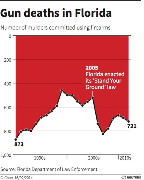
Consider this chart from Reuters:

Without thinking and analyzing it too much what do you perceive happened to the gun violence after 2005? Did it go up or down? If you look close enough and think about it you’ll realize that the number of murders went up, but most likely it’s not what your initial reaction was. The creator of this chart likely tried to use the area chart as a symbol of dripping blood, but our brain expects the data in area chart to be at the bottom. An article about this data in Business Insider includes a user-submitted “corrected” version of the chart where the axis is flipped and there’s no more confusion (no allusion to dripping blood either, though).

To be fair, the bright dominant color of blood would make you pay closer attention and finally realize that the data is at the top of the chart in this case, but it puts an unnecessary cognitive load on the viewer.

In an opposite example, this chart tries to portray the levels of snow in some fictitious mountains:

See the Pen dataviz-tip-020 – snow by amCharts (@amcharts) on CodePen.24419

It displays snowy mountains as white area and then the blue sky above them. While the data is at the bottom and that’s good, the bright dominant color of the “sky” attracts way to much attention and potentially confuses the viewer.

In both of these cases the viewer is able to figure out what’s going on in the charts but the amount of mental work involved is absolutely unnecessary. A much better approach is to just always have the data of the bottom and of dominant color:

See the Pen dataviz-tip-020 – snow-2 by amCharts (@amcharts) on CodePen.24419

The post DataViz Tip #20: In an Area Chart Data Should Be at the Bottom and of Dominant Color appeared first on amCharts.

DataViz Tip #21: Explanatory vs. Exploratory Charts

$
0
0

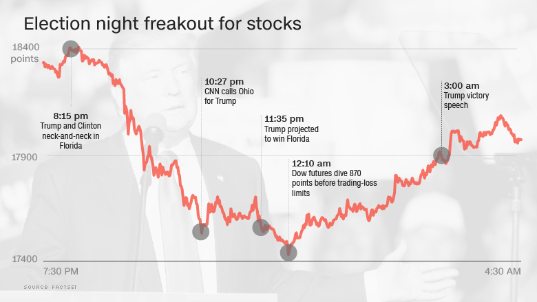
Sometimes you create charts to tell some specific story or drive a point home. Like in this chart of the stock market performance during 2016 US Presidential election night taken from this CNN article:

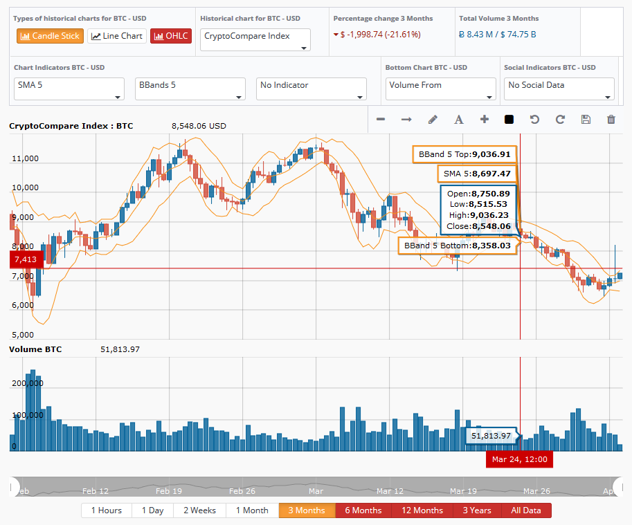
Other times you just want to give your viewers a great tool to explore the data and make their own conclusions. This Bitcoin price chart from CryptoCompare does just that:

It’s interactive and viewers can explore the aspects of the data they are interested in and potentially find some unique insights.

Most of the times you have (or should have) some agenda in mind as of what you are trying to achieve with your data visualization – back your point of view or just give viewers the facts and a great tool to let them work towards their own vision. This is especially true in print or static digital visualizations. But with interactive tools like amCharts, there’s an opportunity to do both – you can call out specific events on an interactive chart, yet let the audience explore the data further.


We are giving away a great data visualization book each month! Subscribe to our newsletter to get monthly tips like the one above and you’ll be automatically entered in the sweepstakes to win an awesome book.

Subscribe to amCharts Newsletter


The post DataViz Tip #21: Explanatory vs. Exploratory Charts appeared first on amCharts.

DataViz Tip #22: Let Simplest Visualizations Lead Your Thought Process

$
0
0

When you get your raw data there’s usually a very straightforward way to visualize it “as is.” Instead of looking at the raw data trying to figure out interesting angles just make the simplest chart (from the data perspective) and let what you see guide your further efforts.

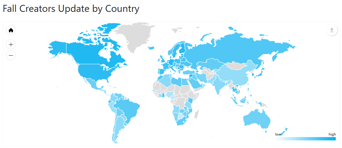
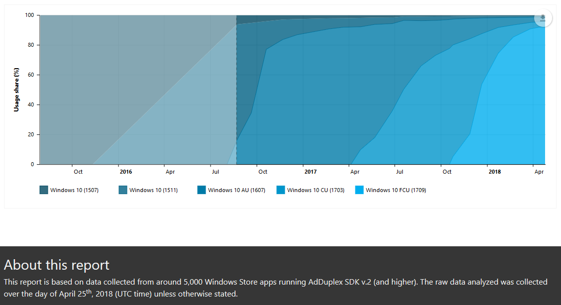
Every month I create reports about the state of the Windows 10 operating system in the wild. Once every few months I extract data about the percentages of PCs on the latest update by country. By just throwing this data into amCharts JavaScript Maps I get this nice result:

After looking at this map I had a gut feeling that there’s maybe some correlation between how wealthy the country is and the velocity with which its residents update Windows on their PCs. So, I combined this data with GDP data from International Monetary Fund and got this:

See the Pen Win10-FCU-GDPPPC-201802 by amCharts (@amcharts) on CodePen.24419

From this visualization I can spot that there probably is a correlation but it’s not very well pronounced. At least visualized like this.

But it gave me another idea. What if we look at the median GDP of the countries where the latest update penetration is below and above global average?

See the Pen Win10-FCU-GDPPPC-median-201802 by amCharts (@amcharts) on CodePen.24419

This looks like a more striking illustration of my thesis.

You can see how by just visualizing my initial dataset I was able to get ideas for possible interesting angles in it.


We are giving away a great data visualization book each month! Subscribe to our newsletter to get monthly tips like the one above and you’ll be automatically entered in the sweepstakes to win an awesome book.

Subscribe to amCharts Newsletter


The post DataViz Tip #22: Let Simplest Visualizations Lead Your Thought Process appeared first on amCharts.

DataViz Tip #23: Use Interactivity To Avoid Overwhelming Viewers With Excessive Data

$
0
0

In static data visualizations, you have to always look for a compromise between showing the whole picture and not overwhelming the viewer by overloading the chart with too many details. Luckily, with interactivity on the web, you can surface the most important information while still letting the viewer explore the details.

Like in this stock chart:

See the Pen Comparing stock indices (using external data) by amCharts (@amcharts) on CodePen.24419

You can see the whole picture and markers for the events that happened. By hovering over the markers viewers can see the details of the event, if they wish. The developer behind the chart didn’t have to make a hard choice of filtering the events or even not showing them at all.


We are giving away a great data visualization book each month! Subscribe to our newsletter to get monthly tips like the one above and you’ll be automatically entered in the sweepstakes to win an awesome book.

Subscribe to amCharts Newsletter


The post DataViz Tip #23: Use Interactivity To Avoid Overwhelming Viewers With Excessive Data appeared first on amCharts.

DataViz Tip #24: Use Eye-Candy to Attract Attention

$
0
0

In the purest data visualization world, things that detract from the comprehension of the data are often frowned upon. Things like 3D charts, visual effects, and other purely aesthetic enhancements are often considered a no-no.

This point of view is perfectly valid and even valuable in a world where you create scientific reports or visualizations for the clients to consume themselves and make strategic decisions.

But in this day and age where attention is one of the most valuable and hard to get currencies, a pleasant, tasteful, understated chart will often have a hard time standing out in the constant stream of information. That’s why we need to analyze every situation, and based on the intended scenario sometimes put dogmas aside and sprinkle some fairy dust on our creations. After all, it’s better to be criticized by the snobs but deliver the message to the target audience, than to be praised by a few for the work no one noticed.

The post DataViz Tip #24: Use Eye-Candy to Attract Attention appeared first on amCharts.

Dear Data – An Inspirational DataViz Book Can Be Yours

$
0
0

Every month we give away a dataviz book to one of our newsletter subscribers. Last month it was the classic The Visual Display of Quantitative Information by Edward R. Tufte. And the book is on its way to India to Abdul Haseeb from Trading System API.

We are continuing the tradition of following a practical book with an inspirational one, and this month the book we want to be yours is Dear Data by Giorgia Lupi and Stefanie Posavec.

Each week for a year, Giorgia and Stefanie sent each other a postcard describing what had happened to them during that week around a particular theme. But they didn’t write it, they drew it: a week of smiling, a week of apologies, a week of desires.

One of the subscribers to our data visualization newsletter will win this book next month. So, make sure you are subscribed and ready to win!

Subscribe to amCharts Newsletter


The post Dear Data – An Inspirational DataViz Book Can Be Yours appeared first on amCharts.


DataViz Tip #25: Credit Sources, Disclose Assumptions

$
0
0

Your data visualizations are based on data (duh!). This data comes from somewhere. When it’s not your data, remember to credit the source. And even when it’s yours a good explanation of where this data comes from and how it was collected goes a long way towards setting the playing field and expectations for the user.

You likely know some aspects of data collection or the sample set that skews the result in one direction or other. Maybe some data is missing and not taken into account in your charts. Possibly, you made assumptions that are obvious to you and most likely right but aren’t backed by any data.

Disclosing all this information in the footnotes or anywhere else, helps your viewers analyze your visualizations with complete background information and mitigates the possibility of them dismissing your findings altogether due to their own assumptions and lack of addressing them from your side.

Case in point…

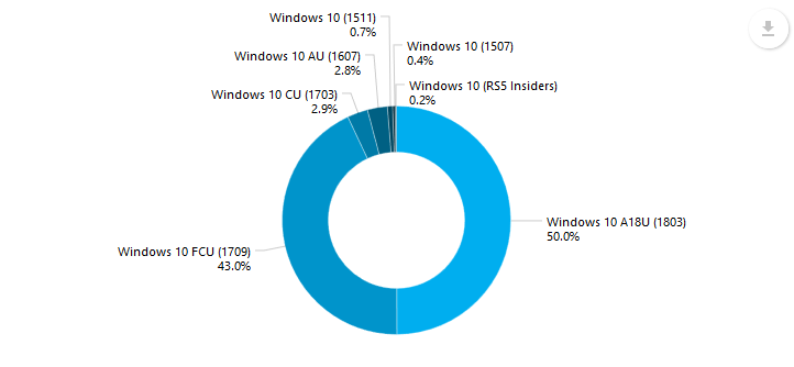
Every month I work on statistics reports for AdDuplex. The data is collected from apps utilizing the company’s advertising SDK. This information is disclosed in the footer but the problem probably is that it stops at the facts and doesn’t explain what effects this may have on the findings. As a result, some people dismiss the findings as inaccurate due to the fact that not many enterprises would run ad-supported apps and enterprises make up a big chunk of all Windows PCs. I intend to expand the data source section with a disclaimer of possible skew in the data in the future reports and, hopefully, alleviate part of these complaints.


We are giving away a great data visualization book each month! Subscribe to our newsletter to get monthly tips like the one above and you’ll be automatically entered in the sweepstakes to win an awesome book.

Subscribe to amCharts Newsletter


The post DataViz Tip #25: Credit Sources, Disclose Assumptions appeared first on amCharts.

DataViz Tip #26: Chart Types: Sankey Diagram

$
0
0

In this and several of the following tips, we will cover some of the more “exotic” chart types you can use to visualize your data. Today we are starting with a Sankey Diagram.

See the Pen amCharts V4: Sankey diagram with draggable nodes by amCharts (@amcharts) on CodePen.24419

Sankey diagrams are used to depict the flow of data between several categories. This chart type is very good at giving viewers a clear picture of how values transition and split from one set of categories to the other. If you are a Google Analytics user you have probably seen a version of Sankey diagram in their Behavior Flow, Goal Flow, and similar diagrams.

See the Pen amCharts V4: Sankey diagram with animated bullets by amCharts (@amcharts) on CodePen.24419

Sankey diagram can either be horizontal or vertical, depending on your data, needs and allocated space.

See the Pen amCharts V4: Vertical Sankey diagram by amCharts (@amcharts) on CodePen.24419

Good news is that you can now easily create Sankey diagrams with amCharts 4. Check out the code for the demos above and dig into docs to get started.


We are giving away a great data visualization book each month! Subscribe to our newsletter to get monthly tips like the one above and you’ll be automatically entered in the sweepstakes to win an awesome book.

Subscribe to amCharts Newsletter


The post DataViz Tip #26: Chart Types: Sankey Diagram appeared first on amCharts.

DataViz Tip #27: Chart Types: Treemap

$
0
0

Treemaps are a great data visualization tool to represent data items as part of a whole. Items in a treemap are represented as rectangles proportionally to their value and fill up the entire chart area. This lets viewers perceive their relative size much better than with slices in a pie chart and it also lends itself to displaying more data items at once than you can reasonably fit in a pie chart. Especially when combined with interactivity features.

See the Pen amCharts V4: Changing tree map data by amCharts (@amcharts) on CodePen.24419

Multiple levels of data can be displayed in a treemap at once to show a deeper picture at a glance:

See the Pen amCharts V4: Tree map with two levels visible by amCharts (@amcharts) on CodePen.24419

Alternatively drill-down functionality can be implemented to declutter the view and help viewers focus on one level at a time:

See the Pen amCharts V4: Drill-down tree map by amCharts (@amcharts) on CodePen.24419

Try clicking on any of the tiles in the demo above to go a level deeper. Click on “Other” to go multiple levels down.

amCharts 4 introduces amazing Treemap visualization support. Check out the documentation and explore the code for the demos above.


We are giving away a great data visualization book each month! Subscribe to our newsletter to get monthly tips like the one above and you’ll be automatically entered in the sweepstakes to win an awesome book.

The post DataViz Tip #27: Chart Types: Treemap appeared first on amCharts.

DataViz Tip #28: Chart Types: Radar and Polar Charts

$
0
0

Radar and Polar charts help you represent series of quantitative variables in a circular manner on axes starting from the same point. You can think of Radar chart as a radial version of a line chart, and Polar chart as a radial bar chart.

See the Pen amCharts V4: Radar chart (1) by amCharts (@amcharts) on CodePen.24419

Both chart types are at their best when variables in a series have some meaningful order. For example, when variables (spokes) represent minutes in an hour, hours in a 24 (or 12) hour cycle, months in a year, etc.

Additionally, radar charts are often used to compare features of multiple subjects. For example, you can show several core stats of multiple basketball players, characters or items (cars, guns) in a vide game etc. These could either be displayed on the same chart or as a series of multiple radar charts side-by-side in a panel.

amCharts 4 support for Radar and Polar charts

You can create a multitude of Radar and Polar chart variants and plays on them with amCharts 4. Check out the documentation to get started and get deep with Radar charts.

These demos should get you a feel of what can be done with RadarChart type in amCharts 4:

See the Pen amCharts V4: Radar timeline chart by amCharts (@amcharts) on CodePen.24419

Try clicking on the continents, zooming in and out, dragging the timeline slider, etc.

See the Pen amCharts V4: Radar chart with date-based axis by amCharts (@amcharts) on CodePen.24419

You can zoom-in by selecting a sector by dragging your mouse.

See the Pen amCharts V4: Radar chart with switched axes by amCharts (@amcharts) on CodePen.24419

See the Pen amCharts V4: Stacked area radar chart by amCharts (@amcharts) on CodePen.24419

Try interacting with the chart – zoom-in/out using sliders or mouse selection.

See the Pen amCharts V4: Zoomable radar chart by amCharts (@amcharts) on CodePen.24419

See the Pen amCharts V4: Variable radius radar chart by amCharts (@amcharts) on CodePen.24419

It doesn’t even have to be a full circle with amCharts 4, if that’s what you are after. Try using the slider at the bottom to change the radius of the whole chart from a full circle to a straight column chart.


We are giving away a great data visualization book each month! Subscribe to our newsletter to get monthly tips like the one above and you’ll be automatically entered in the sweepstakes to win an awesome book.

The post DataViz Tip #28: Chart Types: Radar and Polar Charts appeared first on amCharts.

DataViz Tip #29: Mix Multiple Chart Types

$
0
0

Multiple chart types in one visual are nothing new in the infographics space. In your “regular” functional web charting world this almost never happens. Obviously, not all datasets are best expressed with a multi-type chart mix though some are. The primary reason why you never see such “hybrids” in the wild is that it’s often close to impossible to do technologically. Quite often you are forced to choose your chart type upfront and then you work within the constraints of the type you’ve selected.

The best you can hope to achieve is placing multiple charts side-by-side on some common background and frame them as a single compound object:

See the Pen amCharts V4: Map+Line chart+Gauge mix by amCharts (@amcharts) on CodePen.24419

Luckily, with new generation of libraries like amCharts 4, you can mix and match various chart types in one visual – in other words, anything can be anything. Even in the chart above the “background” is not just an image but a real map chart.

Going a few steps further you can just, say, embed pie charts inside a bar chart:

See the Pen amCharts V4: Column chart with pie charts inside by amCharts (@amcharts) on CodePen.24419

Or use interactions to transform a country into a drilldown pie chart display of some statististics about it:

See the Pen amCharts V4: Countries morphing to pie chart by amCharts (@amcharts) on CodePen.24419

We are only beginning to scratch the surface of what is possible when you are not limited to working within the constraints of a single chart type per visual. Now that technological barriers have been removed, the sky is the limit and developer and designer crativity can flourish.


We are giving away a great data visualization book each month! Subscribe to our newsletter to get monthly tips like the one above and you’ll be automatically entered in the sweepstakes to win an awesome book.

The post DataViz Tip #29: Mix Multiple Chart Types appeared first on amCharts.

DataViz Tip #30: Let Viewers Change Chart Type

$
0
0

When building an infographic you know exactly what your data looks like and can make an editorial decision on the best way to present it. For web applications, on the other hand, the shape and form of live data coming from some data source are not always known upfront. So, whatever you imagine about the data in the design phase may turn out slightly or majorly wrong in production. Even in the least extreme cases, the chart type you chose to visualize the data may not be the best one from viewers perspective considering both the data itself and the insights they are trying to gain from it.

A great way to mitigate this is giving viewers an opportunity to change the chart type or modify its properties.

The most simple form of this is letting viewers switch certain series off and on:

See the Pen amCharts V4: 100% Stacked column chart by amCharts (@amcharts) on CodePen.24419

(try clicking on the series names in the lagend)

Another common trick is to add a switch to change barchart from a stacked to a grouped (clustered) one as demonstrated here. One more common scenario is switching between a column and line chart.

On a more advanced scale you may give your viewers an opportunity to “straighten” a radar chart, for example, if looking at it in a bar chart form makes more sense to them:

See the Pen amCharts V4: Radar timeline chart by amCharts (@amcharts) on CodePen.24419

(drag the lowest slider all the way to the left)


Subscribe to our newsletter to get monthly tips like the one above

The post DataViz Tip #30: Let Viewers Change Chart Type appeared first on amCharts.

DataViz Tip #31: Labels vs. Legends

$
0
0

A rule of thumb is you should annotate your chart items right there next to them whenever possible.

This gives your viewers an easy way to evaluate and understand the data presented.

This is all great but what if you have a very limited space to work in? You may either be on a smartphone or just limited by page design constraints. A chart cluttered with data labels is not a pretty sight. In these cases consider hiding the labels and turning the legend on.


Subscribe to our newsletter to get monthly tips like the one above


The post DataViz Tip #31: Labels vs. Legends appeared first on amCharts.


DataViz Tip #32: Chart Types: Chord Diagram

$
0
0

Chord Diagrams help us visualize relationships between data arranged beautifully in a circle. You can use Chord Diagrams to visualize data ranging from relationships between Lost characters to Uber rides between neighbourhoods in a city to complex scientific subjects that are even hard to pronounce.

See the Pen amCharts 4: Chord Diagram with link toggling by amCharts (@amcharts) on CodePen.24419

amCharts 4 includes powerful tools to create your own interactive Chord Diagrams. Users can explore the chart, switch certain data points off and on, and more. Check out the Anatomy of a Chord Diagram in the documentation to see a comprehensive tutorial for implementing a Chord Diagram in your own web projects.


Subscribe to our newsletter to get monthly tips like the one above.

The post DataViz Tip #32: Chart Types: Chord Diagram appeared first on amCharts.

amCharts 4 v4.0.16 released

$
0
0

While the world was finishing Holiday meals, we were hard at work improving amCharts 4. As a result, we’ve already published 3 releases in 2019 with 4.0.16 being the latest.

Here’s a combined change log for versions 4.0.14 through 4.0.16:

Added

  • New setting zoomStep added to MapChart. Allows controlling zoom in/out speed.
  • color property added to LegendDataItem. Can be used for coloring label or valueLabel text like text = "[{color}] {name}".
  • minZoomCount added to Component.
  • Export now allows formatting numberic values as durations. Use newly added durationFields and durationFormat settings.
  • Export: When exporting date to XLSX, date fields will now export as true date fields in Excel (which in turn will format them according to regional settings), unless useLocal is set to false.

Changed

  • Export: When exporting date to XLSX, date fields will now export as true date fields in Excel (which in turn will format them according to regional settings), unless useLocal is set to false.
  • Renamed Swedish locale to sv_SE.

Fixed

  • Series.hidden did not work as expected.
  • World map did not work in Ember.
  • Eliminated multiple warnings in recent version of Chrome regarding wheel events being active.
  • Fixed mousewheel zoom in IEs.
  • Draggable/resizable items were not working properly on some Android browsers.
  • Setting height to a relative value for a horizontal ColumnSeries column template was not working propertly.
  • Charts were not working properly in FireFox Extended Support Release.
  • Some computer setups were not properly registering mouse movement.
  • legendSettings was being ignored initially if legend was in external container.
  • “Week year” (format code "YYYY") was not being properly calculated.
  • Interactions on MacOS Safari was broken sincle last update.

The newest release is available through the usual channels.

The post amCharts 4 v4.0.16 released appeared first on amCharts.

Massive data performance improvements in 4.0.17

$
0
0

We have just released version 4.0.17 of amCharts 4 which features dramatic performance improvements for charts with tens and hundreds of thousands of data points, among other fixes and improvements. As usual, you can get the update via all of of our channels.

Here’s the complete change log:

Fixed

  • Dramatically improved performance for data-heavy charts (with 10s and 100s of thousands of data points).
  • SmallMap viewport indicator rectangle was positioned incorrectly.
  • Clicking on SmallMap was not moving map to correct location.
  • Lines from GeoJSON were not drawn by MapLineSeries.
  • Issue with multiple data points on the same date fixed (not all data points were visible at the end of selection).


The post Massive data performance improvements in 4.0.17 appeared first on amCharts.

Creating Amazing Animated Chart-based Stories

$
0
0

See the Pen Deconstructing amCharts movie by amCharts team (@amcharts) on CodePen.0

When we launched amCharts 4 most visitors to our front page couldn’t believe that the animation at the top was an actual live JavaScript demo of the library. We’ve been asked to detail how this was done a number of times. And we are happy to oblige.

Antanas Marcelionis – our lead developer – has written an extensive tutorial on how this movie was made and explained a few amCharts 4 concepts along the way.

Check it out at CSS-Tricks.

The post Creating Amazing Animated Chart-based Stories appeared first on amCharts.

23 new localizations in amCharts 4.0.22

$
0
0

The just-released amCharts v.4.0.22 includes 23 new localizations, thanks to Bjorn Svensson!

Get it from our Download page.

More additions and fixes were made between versions 4.0.18 and 4.0.22. Here’s the change log:

Added

  • 23 new locales: Arabic, Bosnian, Catalan, Czech, Greek, Estonian, Finnish, Hebrew, Hindi, Croatian, Hungarian, Indonesian, Japanese, Korean, Latvian, Polish, Romanian, Serbian, Thai, Turkish, Vietnamese, Chinese (simplified and traditional versions). Thanks Bjorn Svensson!
  • JSON: Better id checking and error reporting.

Fixed

  • It is no longer necessary to use "strictFunctionTypes": false, thanks to goloveychuk for their help.
  • Broken images were causing export to fail.
  • Setting Series’ name to a number with percent sign was resulting in breakage of the whole chart.
  • Issues that caused errors in Map an Percent charts on data update and dispose fixed.
  • Chart with ColumnSeries was failing with an error when data was updated.
  • MapLineSeries with direct data set were somewhat broken since last update.
  • Export menu no longer shows DATA menu for MapChart (and other charts if data is empty).
  • JSON: Some empty properties like dummyData were not being set properly.
  • Disposing a chart or series when Legend was enbled was resulting in error.

The post 23 new localizations in amCharts 4.0.22 appeared first on amCharts.

Viewing all 101 articles
Browse latest View live